
Seeing them side by side, the newer Microsoft logo sucks ass.
Did you know FedEx has an arrow in the negative space, representing their quickness, precision, the pursuit of excellence and tenacity in the face of adversity?
You have been promoted to Director of Marketing. Clowngratulations
Super neat to know this! I wonder if we can examine other corporate logos and see what hidden messages they have!
Checks Ubisoft and Hewlett-Packard logos
Huh. There’s something odd about the logos for both these companies. All I see is “negative”, not even “negative space”. Is it normal for the company to just be completely negative, or am I misreading the logo?
you joke but as a designer i think Ubisoft’s logo is really good at conveying the downward spiral the quality of their games has been going through.
would i be able to sure them for false advertising? only FedEx doesn’t deliver to my apartment for some reason and says it’s an unreachable destination.
Is there any example in history of something coming to mean its opposite?
Quite a few. The most recent well-known one is people often now using ‘literally’ to mean ‘figuratively,’ but there are other examples-
Also, the American Fascist Party is still officially called the Republican Party even though it wants to change the government form to theocratic fascism 🤷
Swastika is a good example.
Oh yeah! Its funny, you can go to 19th century monuments in the US with swastikas carved into the stone.
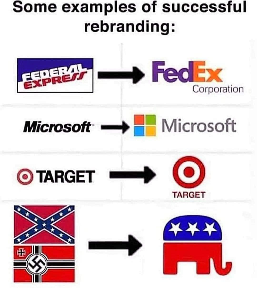
Is changing a logo but keeping the name considered rabranding? I thought it was when the name was also changed. Some oil companies did it to avoid the bad press on the old name.
