

You must log in or register to comment.
Lol, must be a headache for the devs maintaining it, but from the end user perspective it is way more pleasant of an experience than epic, origin, gog, ubi and whatever else is out there.
Whatever you do don’t look up the video where a ux person fixes steam it will make you more annoyed.
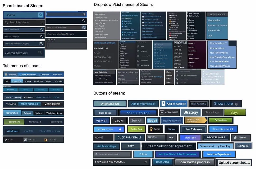
Counterpoint: I can identify which part of the UI most of those come from. This level of variety between various UI functions is actually good. I don’t want the interface tabs or the settings tabs to be confused with tabs in the store, even though they are all tabs. I don’t want buttons to all look the same, especially not the huge purchase button. But even accepting that as an outlier I want some buttons to be clearly part of the steam UI and some as part of the site page I am on, so I don’t get confused.
And i hope it never changes. It works. Don’t touch it!
Steam has a decade of different design choices stacked on top of each other. It’s weird AF that they just don’t update some of their old styles, but what’re gonna do?
While the app is definitely ugly, I spend less time on Steam than in the games I am launching with it. But I do not use any of the community features. If an online search brings me to a steam community, that’s how I end up there, for no other reason really.
Wow. This comments section reads like 50 various versions of Colin Robinson, all swarming on this very post. Every single one of them finding a way to be more pedantic or curmudgeonly than the other.
Can’t you customize steam with CSS tho. But holy shit I didnt notice this until now.
The only thing it lacks to me, is a menu to navigate to the game’s wine prefix. They already have one for the installation files, now they just need to add one for the prefix too
As someone with crazy UI old, steam is not at the top of my list of problematic programs (Looking at everything epic has made. Seriously opening unreal engine is like a flashbang of what does this button even do?)
But honestly, steam is easy to understand, the worst page is scrolling though games with its weird scrolling mechanic in the categories section.
Reminds me of Windows UI — usable, but inconsistent. Obviously a lot of glommed on tech debt that was never updated.
Why did that get downvotes? This meme here is a remake of the meme about Windows’ UIs.
And you still have to have it running, including their pseudo webbrowser, to log into your Steam account in a third-party tool.
They should just provide an API with conditions for their DRM.
And workshop should have a “Download” button, steamcmd sucks for that.
Really insane that companies will pay for memes like this to be posted but refuse to develop viable competition


